DESIGN
Interface Guidance
This page details font-sizes, color choices, the overall hierarchy and design language of the site. It's probably too much detail, but it remains helpful for me to see in building out the site.
Palette
global.css @theme + the two dark blocks · src/data/palette.ts · right half of a tile = its tints, strongest first · hex shown for the mode you're in (◑ to flip); the Pantone names belong to the light values
ink#1a1a1a#f1eaf7headings, strong, figure numbers
wash neutral ground — chips, cite box, slide frames
ink-soft#4a4a4a#dcd6e2body text
ink-faint#767676#958f9cmeta, captions, section labels
line = line — rules, dividers, pills, underlines
bg#ffffff#120a1apage ground
deep-blue#0f4e67#4f93b8 · Moroccan Bluetalk button, P. figures
line hero nav active, the 404
blue#2a4b7c#94c1f8 · Galaxy Bluelinks
line Published button border
wash active chip, card disc, button hover (incl. PDF)
teal#0a6f69#4aa39b · Tidepooleyebrows, Slides / Recording, inbox counter, W. figures
line Slides button border
wash card disc, button hover
green#008658#75d696 · Jelly Beanmy name in author lists, ACM DL button
line ACM DL border
wash ACM DL hover
lime#a6be47#a6be47 · White Grapeaccent, not used yet
amber#bb5c14#fea571 · Hawaiian SunsetForthcoming, awards, card accent
line Forthcoming border
wash Forthcoming fill, card disc
tangerine#ff8812#ff8812 · Autumn GloryT. figures
berry#b91428#e04a58 · Goji BerryarXiv button, Q. figures
line arXiv border
wash arXiv hover
pink#fa018b#fa018b · Pink GloSubscribe button, S. figures
violet#784384#a672b8 · Bright VioletH. figures
Tints — two strengths, no others: -wash 10% (18% in dark mode) any quiet fill (pills, hover, card discs, chips; neutral = ink-wash) · -line 40% any quiet edge (outlined borders, underlines; neutral = ink-faint-line). Greys: ink · ink-soft · ink-faint, plus ink-wash and line (= ink-faint-line) — five, no more.
Everything above is a --color-* token and follows dark mode. Still fixed by design: the white text and black gradient over the hero photo (HeroHeader.astro), and the white label on the Subscribe button.
Type
Wordmark · Barlow Condensed 700 · --font-display · self-hosted
PGK
Page titles · Hanken Grotesk 500 · --font-title · main h1 at 3xl
Privacy Nutrition Labels
Body · Hanken Grotesk variable 100–900, upright + italic · --font-body · self-hosted · Tailwind's own ladder on a 17px root, untouched, no arbitrary sizes · two faces: Barlow Condensed (wordmark) · Hanken Grotesk (everything else)
PGK | 5xl · wordmark, Barlow Condensed 700 · 4xl on phones, 2xl in the compact header | |
Page title | 3xl · Hanken 500 · main h1 | |
Section heading — h2 | 2xl bold | |
Subheading — h3, paper titles | xl semibold | |
Lift-out — a project's opening paragraph | xl · .project-body > p:first-of-type | |
Prose — running text on detail pages | lg · .prose-lg | |
Nav | base semibold, tracking-wide | |
Base — index-page text, intros | base | |
Small — paper rows, news, lists, meta | sm | |
Eyebrow | sm bold, tracking-widest | |
Section label | sm bold, tracking-widest | |
Extra small — dates, captions, footnotes | xs | |
Label — buttons, pills, chips, tags | xs uppercase, tracking-wider |
Eyebrow · uppercase tracking-widest text-sm font-bold text-teal mb-3
Speaking
Section label · homepage · text-sm font-bold uppercase tracking-widest text-ink-faint
Featured Projects
All-caps words · <caps> · 0.92em + tracking, so acronyms don't shout
USENIX
Page header
Eyebrow · h1 · lede · max-w-4xl mx-auto px-6 py-12
Vocabulary
Keywords
All of my academic work, grouped by keyword.
Prose
.prose.prose-lg · a real project body (projects/privacy-nutrition-labels.md) · links · ↗ on off-site links · numbered <figure> · hover-# heading anchors
My dissertation focused on designing better privacy displays for people.
Privacy policies (the corporate-and-lawyer-developed solution to stave off the threat of regulation in the mid-1990s) are long, text documents, often written with legal jargon and require a high reading level for comprehension, don’t work, and have never worked for people online.
Two initial studies on re-designing privacy policies inspired by formal labeling efforts (nutrition, energy, etc.) showed that nearly any re-design can improve privacy policies for consumers. The prior effort here was the work I won the SIGCHI Student Research Competition with, and later the ACM SRC Grand Finals (best research, graduate level).
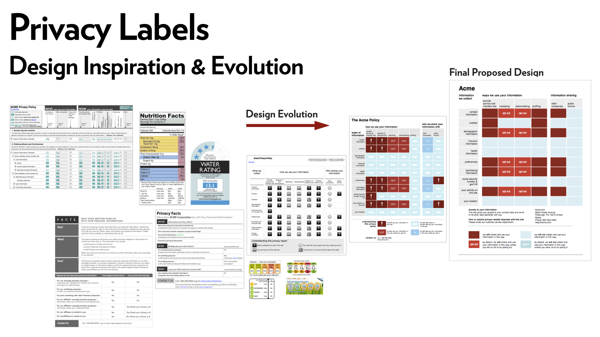
But it was clear that adoption here would be a giant mess. Every website would need to decide to use this standard label format, or regulation would need to be created to require its use. Neither seemed likely.
At this moment though, the early app stores (Apple App Store, Android Store) were launching. These two centralized providers did have the ability to require every app on their marketplaces to use a standard privacy display, and both had already developed sets of permissions to put security controls in place. Why not privacy labels too?
We wrote two studies to understand how privacy and permissions were understood, what role they play in consumer decision making, and developed a prototype label for Android to run simulated tests on. We found these privacy labels did directly influence user decision making, though with substantial limits.
We published the work (2012 & 2013), I defended my dissertation, and the team moved on to other research ideas.
~ ~ time passes ~ ~
Then, in 2020, we (Lorrie) received a call that said within hours Apple would be launching a version of these labels. They announced them at WWDC on June 22, 2020. At the time, I was working at Google, though not on Android, and they quickly (shockingly!) figured out I was at the company, and found me to ask if I had done this work and if I had any ideas for improving upon the Apple labels. I suggested a few ideas, which as I expected were not taken up. And within months Google had announced they too would have Data Safety Labels (not privacy!) that also bore a strong resemblance to the label designs I had made in the summer of 2012. (I tell this story in the Test of Time talk that USEC awarded us for the first of the two app papers)
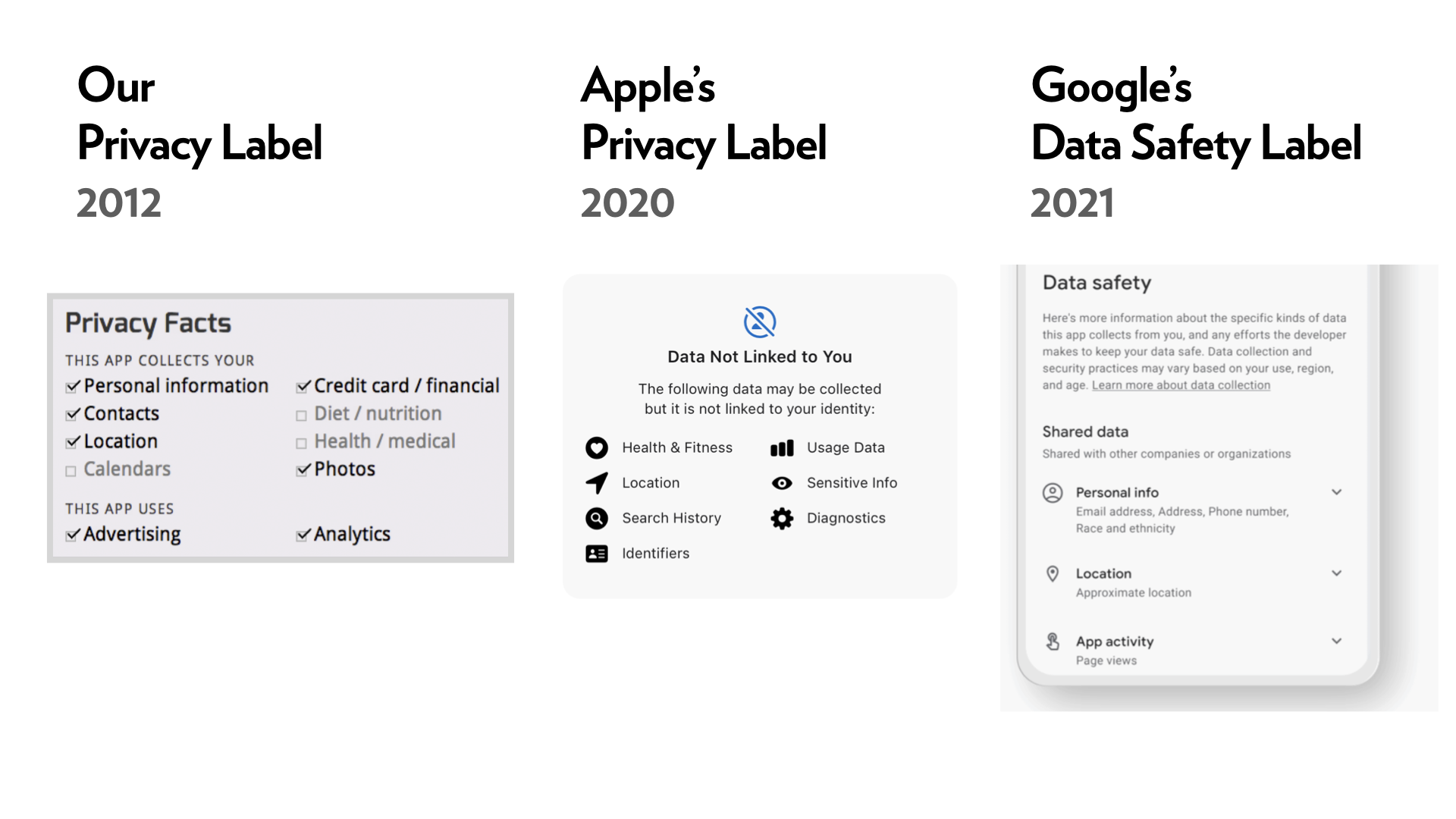
While this is one of my greatest stories of research impact – Lorrie, I, and our team didn’t (to our knowledge) ever directly pitch these labels to any of the right people that made this happen. We published good work, and it landed in the right places, eventually, somehow, likely with a fair bit of luck!
… and it’s a story for another time how helpful these labels are now that they have been in use for several years…
Links
Three, no more · .link blue always (chrome, prose via .prose a) · .link-quiet ink until hovered (CV lists, jump-links) · .link-title ink + hairline underline (entry titles in lists) · all three take the blue wash on hover
Lists & cards
Paper row · PaperEntry.astro · keyword chips are .kw-tag, filled, unlike the pills
- 2009
1.Patrick Gage Kelley, Joanna Bresee, Robert W. Reeder, Lorrie Faith Cranor. Design of a Privacy Label. Proceedings of the 5th Symposium on Usable Privacy and Security (SOUPS '09), 2009.
1st Place, ACM SIGCHI Student Research Competition, 2009.
Project card · ProjectCard.astro · homepage grid sm:grid-cols-2 gap-4 — one column under 640px
News row · homepage · divide-y divide-line border-y
- Oct 2026
This week at
AIES we’re presenting our paper on how people think AI makes mistakes (they know it does you don’t have to keep telling them). - Sep 2026
Our NeurIPS paper designing and executing a benchmark of privacy and safety questions that people would realistically ask, HelpBench, was accepted.
Figures
Body figure · <figure class="md-figure"> · "Figure N." is a CSS counter · caption = image title
Hero caption · top-right of every hero · heroCaption → "Figure 1." and body figures start at 2
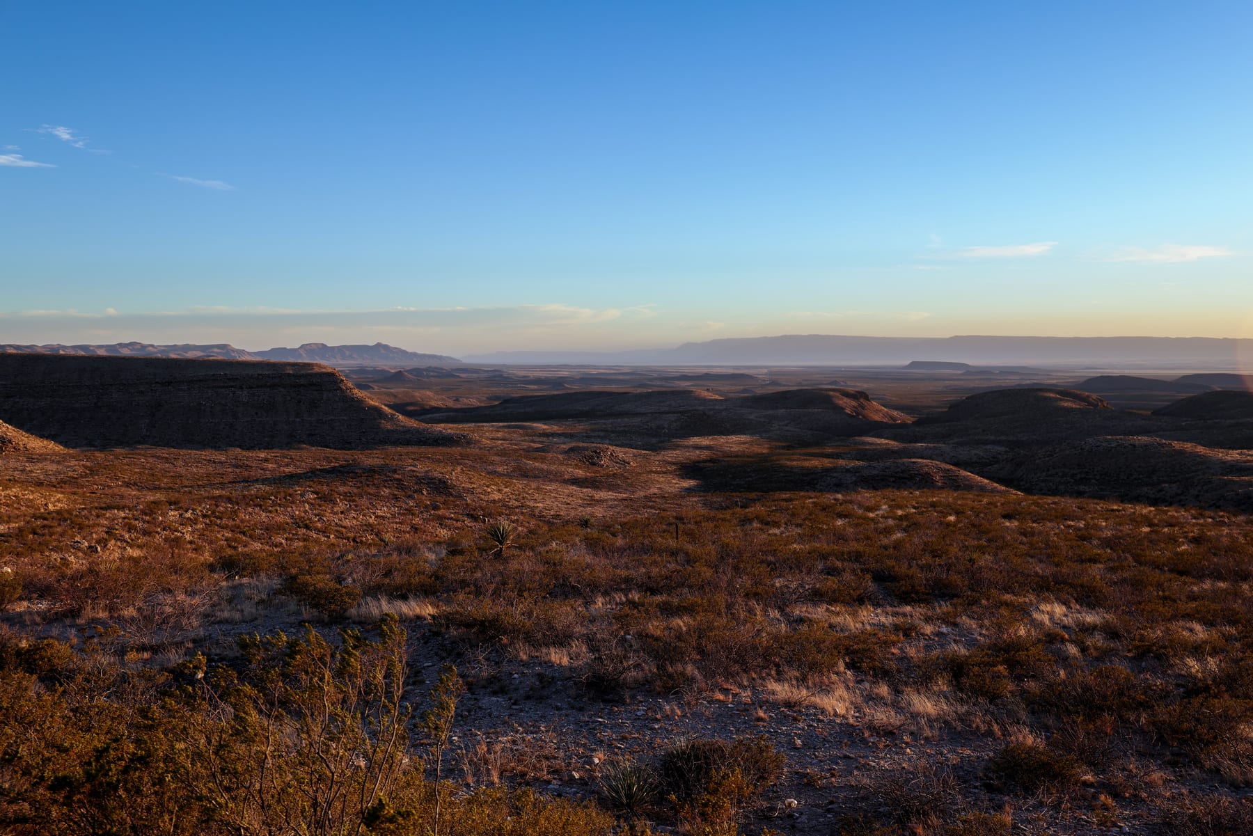
Figure 1. West Texas Landscape, January 2026.
/figures/ prefixes · position in figures.json is the number, forever
H.4 HeroP.4 ProjectQ.4 QuarterlyW.4 WritingT.4 TalkS.4 See Attached Figure
Talk essay wayfinding
Scroll-progress line (3px, top of viewport, --color-blue) · "N / M" counter (bottom-right) · ←/→ keys · #sN slide anchors
Components
Cite box · CiteBox.astro · BibTeX from frontmatter
Cite this paper
@inproceedings{kelley2009design,
  title     = {Design of a Privacy Label},
  author    = {Kelley, Patrick Gage and Bresee, Joanna and Reeder, Robert W. and Cranor, Lorrie Faith},
  year      = {2009},
  doi       = {10.1145/1572532.1572538},
  url       = {https://doi.org/10.1145/1572532.1572538},
  booktitle = {Proceedings of the 5th Symposium on Usable Privacy and Security (SOUPS '09), 2009},
  publisher = {Association for Computing Machinery},
  address   = {New York, NY, USA},
}Inbox counter · InboxCounter.astro · hourly IMAP sample + 14-day sparkline
2.9k emails in the inbox on the evening of October 21st
Newsletter signup · NewsletterSignup.astro · our own form against Ghost's members API · button = pink
Occasionally, I'd love to send you a short update via electronic mail.
If you'd like that too, you can put your email in the little box below, where I promise to do my best to take good care of it (I'm not going to sell it. It's just for my little letters.)
Theme toggle · ThemeToggle.astro · the ◑ in the hero corner · system → dark → light
Layout
max-w-4xl | index pages, lists, keywords, this page |
max-w-3xl | detail pages — project, paper, blog post |
max-w-2xl | ledes and single-column text blocks inside a wider page |
px-6 py-12 | page gutter and top/bottom padding |
≥ 64rem | blog footnotes lift into the right margin as sidenotes |
@media print | chrome hidden, light palette forced — /cv/ and /papers/ print as documents |
| hero | every page, photographic, Barlow Condensed wordmark + Hanken nav on one baseline, ◑ toggle; writing pages opt out (noHero) |